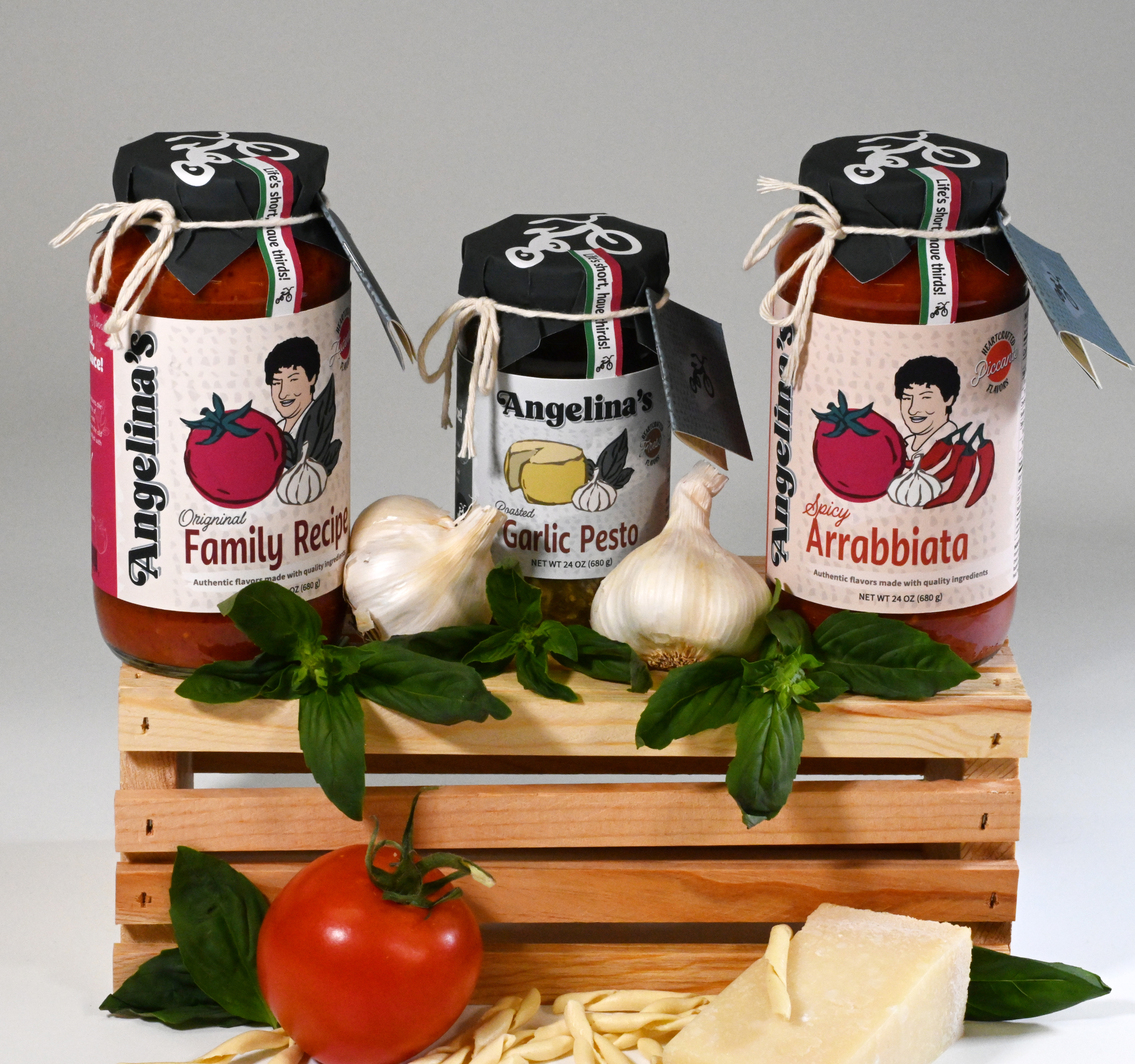
The Family Recipe is in Safe Hands
-
 Illustrator
-
 Photoshop
- Sketching
A brand infused with the heart and soul of Nonna’s cherished recipes.
The Challenge
The challenge in branding Angelina’s was to capture the warmth of Pasta Sundays at Grandma’s—nostalgic yet simple, balancing tradition with modernity and a hint of Nonna’s humor.
The Solution
Remembering the feeling of my family's Sunday dinners was an essential part to channeling that feeling into a brand. The family connection, the loud conversation, the food! Bringing it all together to share my family with yours.
Meet Nonna Angelina—The Sauce Queen!
Although she is serious about the ingredients and quality of her cooking, life does not need to be as serious all the time. In fact she thinks humor is an important ingredient we add to make the flavors just right! Like we always say about Nonna Angelina, “She damn well knows how to cook, but we would not trust her to drive.”